The struggles scaling data teams face

This article has been co-written with Louise de Leyritz from Castor
While hiring has slowed in most industries, many data teams are still growing. With tools such as dbt and Looker, creating new data models and dashboards for everyone to use has never been easier.
But this has come with a set of scaling challenges and complexities that Tristan Handy from dbt has articulated in the article The next big step forwards for analytics engineering.
- Velocity and agility have slowed, creating frustration both inside and outside the data team.
- Collaboration becomes harder as no one is familiar with the entire code base. Time spent in meetings goes up relative to time spent getting things done.
- Quality becomes harder to enforce over a growing surface area and user-reported errors increase.
- SLA achievement declines as more jobs fail, but no amount of retros seems to reverse this trend.
The outline from dbt on the number of projects based on model size confirms that many teams have large deployments
- 48% have less than 100 models
- 32 % have between 100 and 1,000 models
- 15% have between 1,000 and 5,000 models
- 5% have more than 5,000 models
As a rule of thumb, in our experience the data stack complexity starts to get difficult to manage around 300 data models. Based on the numbers from dbt more than 50% of dbt projects and companies using dbt are potentially dealing with scaling challenges every day.

If we put spotlight on 50 well known scaleups, most have surpassed the 10 person data mark. The size of the data team and the number of data models and dashboards is loosely correlated and can be a good indicator for when complexity kicks in.

In this post we’ll look into what happens across the lifecycle of larger data teams, from onboarding to development, monitoring and self-serve - and some steps you can take to overcome these challenges.
- Onboarding – new data team members struggle to onboard onto larger data stacks
- Development – the development cycle slows down with complexity
- Monitoring – staying on top of data issues gets exponentially more difficult
- Self serve – data asset sprawl makes self serve practically impossible
How data sprawl affects data teams
Onboarding
“Collaboration becomes harder as no one is familiar with the entire code base. Time spent in meetings goes up relative to time spent getting things done.”
As data teams grow, so does the challenge of onboarding new members. A data person is considered operational when they have a clear understanding of the data projects, their evolution, the company’s owned data, and where to locate it.
When teams were dealing with fewer data assets, it was possible to walk a new hire through the relevant projects and dashboards in a matter of days. The sheer volume of data models and dashboards have now made this impossible.
In the past, a single person or team could document all the necessary tables and dashboards, or veterans within the team could offer guidance. However, as data teams scale, this siloed knowledge approach is no longer feasible.
Traditional methods of documentation also fall short as no one person knows all the data, making it increasingly difficult to onboard new hires and get them up to speed quickly.
Development
“Velocity and agility have slowed, creating frustration both inside and outside the data team.”
One of the most painful realizations for data teams is the gradual decline of development speed. This slows the pace of which new ideas and hypotheses are brought to life and makes data practitioners less productive.
“We want to build a world where any data scientist can have an idea on the way to work, and explore it end-to-end by midday.” - Monzo, UK scale-up
A few things start to happen as the data team grows
- Slow CI – Continuous integration checks take a bit longer each day. In the past you could deploy code and see it live in production in minutes but now it takes many hours making iteration cycles slower
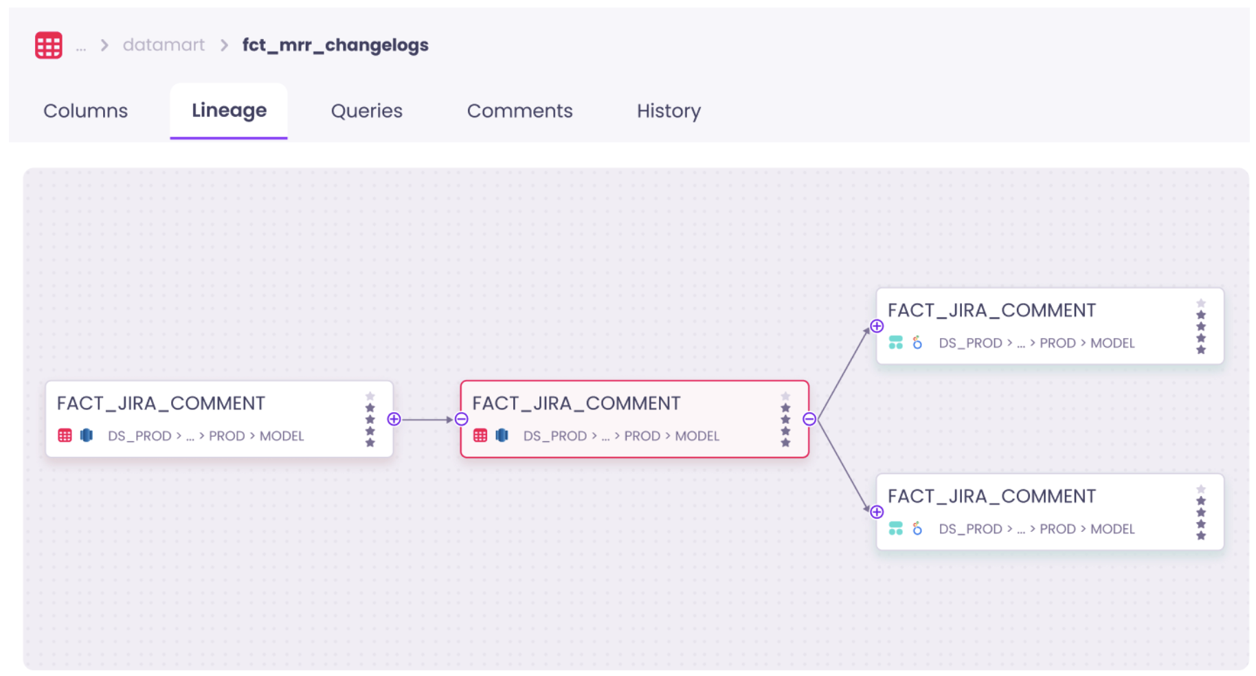
- Bloated lineage – The lineage has gotten so bloated that nobody knows what’s going on. This means that it’s unclear what the downstream implications are of making changes
- Unclear definitions – There are dozens of definitions of the same metrics and dimensions and you no longer know which ones you can include in a new data model
Quality & monitoring
“Quality becomes harder to enforce over a growing surface area and user-reported errors increase.”
It gets exponentially more difficult to ensure the quality of your data as you scale. One area that’s especially difficult at scale is monitoring issues. Monitoring in many ways is akin to the broken windows theory. The broken windows theory can be traced back to criminology and suggests that if you leave a window broken in a compound everything else starts to fall apart. If residents start seeing that things are falling apart they stop caring about other things as well.

In the early days, data tests are carefully implemented in the places where it makes sense and each alert is addressed and resolved, often within the same day.
As the data team scales it’s not uncommon for the Slack channel to look like a jammed traffic intersection with dozens of new alerts each morning. Ownership of issues become unclear, and in some cases many of them go unaddressed. This has several negative consequences
- Important issues get overlooked
- Triaging and monitoring alerts become a time sink
- The data team loses confidence in the impact of writing tests
Self service
“As pools of confidential data grow, more users will want access. Data owners don’t want users to take more from the pool than authorized, especially in tightly regulated industries.”
Scaling data teams can make self-service analytics practically impossible due to two primary barriers: a psychological barrier and a data accessibility one.
The psychological barrier arises from the overwhelming number of dashboards and tools that come with an increasing number of data projects. Business users are expected to leverage data on their own, but the sheer volume of information makes it challenging for stakeholders to determine which data assets are relevant, which dashboard to use, or what calculation to apply for specific metrics.
The accessibility barrier relates to the need to control data access in accordance with tightening data regulations, such as GDPR or CCPA. Currently, many organizations designate a single person or team responsible for managing data access and keep data under control. With today’s data volumes, it is impossible for a single team to manage data access without hindering self-service.
Additionally, the pipelines run a bit slower every day meaning that stakeholders can only consume up-to-date data around midday. You have so many dependencies that you no longer know what depends on what. Before you know it you find yourself in a mess that’s hard to get out of. That upstream data model with hundreds of downstream dependencies is made 30 minutes slower by one quirky join that someone made without knowing the consequences. Your data pipeline gradually degrades until stakeholders start complaining that data is never ready before noon. At that point you have to drop everything to fix it and spend months on something that could have been avoided.
What can be done to manage data sprawl?
Clean up what’s not needed
The most impactful initiative to declutter your data stack is getting rid of data assets that are not needed. While there’s no set definition of an unneeded data assets, signs you can look out for are
- Dashboards with low usage
- Dashboards that have large overlap with other dashboards
- Data models with no downstream dependencies
- Columns in data models that are not used downstream
Decluttering a bloated data stack is no easy task and if possible you should have an ongoing investment into getting rid of unused tables, data models, columns and dashboards. However, many scaling companies find themselves on the backfoot and only address this once they have thousands of data models and dashboards.
Here’s a real-life story from a scaling company to dramatically reduce the number of Looker dashboards which made self serve near impossible
- The data team created a Looker dashboard for Looker usage and scheduled a monthly report to be sent out to the #data-team slack channel (Looker lets you access this data in the System Activity Explores). The report contained a) number of dashboards b) number of looks c) number of users d) number of exec (VP/C-level) users
- The dashboard lets you sort by owner domain and usage to quickly see which dashboards were unused, and who were best placed to make a call on if they could be deleted
- The team introduced the concept of “tiered dashboards”. An example of a tier 1 dashboard could be a board level KPI dashboards. A tier 3 dashboard could be one for a small product team. They made specific requirements for tier 1 dashboards around design consistency, peer review requirements and monitoring of usage
- If exec users were regularly using a dashboard that was not tier 1, that dashboard was reviewed to tier 1 standards
You can apply many of the same steps if you’re working on decluttering your data models in dbt. We’ve seen teams particularly benefit from having a well mapped column level lineage that extends from dbt to their BI tool. This helps you quickly and confidently assess the full downstream impact of deleting a data model or column.
Enrich data with the right context
Another step to keep the level of self-serve ability on your warehouse high is to make sure that your data assets are documented with the right context.
There’s no one solution that fits all for keeping documentation of data assets up to date but the most common options are leveraging yml files in dbt or using a data catalog.
We often see teams benefit from explicitly defining the following metadata
- Description – a brief description of the data asset (e.g. “number of active users in the last 7 business days”)
- Owner – who the owner of the data asset is (e.g. Jane Doe or sales-data)
- Importance – how important the data asset is (e.g. gold, silver, bronze)
The biggest challenge is for teams to be consistent and rigorous when documenting the data. It’s a common pitfall that teams start out with good intentions when documenting data assets but gradually stop doing it.
First, data documentation should be crowdsourced so that documentation can be leveraged from the people who are close to the data. You can use tools such as dbt pre-commit to enforce a specific set of metadata to be documented before committing it to the code base. This is a slippery slope that often leads to people thinking that documentation is not important.
Second, the data assets should be discoverable so everyone has one place to go to see the latest definitions. Good places for this can be dbt docs or your data catalog tool. Traditionally, documentation has been siloed in various tools, making it challenging for users to find the information they need. By gathering all data documentation in a centralized repository such as a data catalog and pushing it back to all the relevant tools, users can access the information they need without leaving their native work environment. This approach ensures that users have access to the most up-to-date information and can work more efficiently.

Be ruthless about reliability to build trust
Be explicit about your severity levels for data issues
If you treat all issues equally important, you’re likely doing something wrong. Some are minor issues that don’t have any material business impact, and others mean you have to drop everything to fix a critical issue.
Dealing with these two types of issues requires a very different approach, but too often, this is not explicitly defined. This leads to negative side effects such as important issues not being acted on fast enough or non-important data issues derailing the data team.
We recommend using three parameters to assess the severity of an issue:
- Critical use case – Does the data have a business-critical use case
- Downstream impact – How many downstream assets and users are affected
- Magnitude – What is the impact on the underlying data

You should aim to be able to assess all three within 5 minutes of being made aware of an issue.
Read the full guide on Designing severity levels for data issues guide for concrete steps to get started.
Add automated monitoring to your core assets
Your first resort should be explicit controls such as dbt tests as these can help cover gaps and tightly couples your business knowledge to expectations from the data. Adding checks to automatically detect anomalies on your data can be helpful to learn about issues that your explicit controls may not capture.
Anomaly detection controls can help you detect issues across quality, freshness, volume and schema issues.

If you’ve already got a lot of issues that are being flagged from your dbt tests, the last thing you want is another in-flow of alerts to deal with.
We recommend that you take the following steps if you want to get started with anomaly detection tests
- Start by addressing your dbt tests failures; fix them or get rid tests that have been unaddressed for long
- Implement anomaly detection tests only on your most important data assets
- Send the alerts from the anomaly detection tests to a separate channel and have a clear ownership or rota for who looks at them
Build an alerting workflow that’s fit for scale
Too many teams haven’t adjusted their alerting workflow to fit their scale. If you’re using an orchestration tool like Airflow you can build bespoke alerts that fit your use cases.
Here are some steps we’ve teams who’re best in control of their alerting workflow take
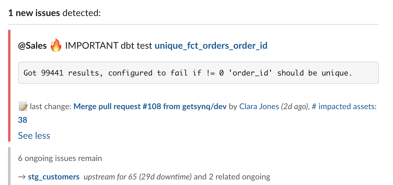
- Activate metadata – display metadata in alerts such as owner and importance directly from the yml files
- Criticality – issues on critical data assets are marked with a 🔥icon. Downstream impact, including BI assets, are displayed directly on the alert
- Owner – owner metadata is used to tag people or route alerts to the relevant channel. Displaying who pushed the most recent code on the data model gives directions of who to contact in cases where ownership is not defined
- Error message – bringing out the explicit test error message directly in the alert speeds up debugging cycles
Set and monitor SLAs for core data
There’s no shortage of ways you can measure data quality (or opinions of how it should be done). In reality, it often comes down to the business context of the company you work in as well as expectations of the data from the business. To be on the forefront of data gradually running slower and issues going unaddressed, these three metrics can be a good starting point
- SLA – % of days your data is ready on time (e.g. 8am)
- Runtime – Time it takes to run the entire pipeline
- Asset health – % of days where core data asset didn’t have a model or test failure
Summary
In this post we’ve looked at the challenges data teams face with scale around onboarding, development, monitoring and self serve. If you find yourself with struggling with challenges in these areas as you scale, we suggest exploring the following actions
- Clean up what’s not needed – remove unused assets and be explicit about which data assets are core to your business
- Enrich data with the right context – add the right context to your data to make it easier for people who are less familiar with the assets to self serve
- Be ruthless about reliability to build trust – build an alerting workflow that’s fit for scale, be clear about which issues are critical and add automated monitoring where your tests fall short

.png)
.png)