Measuring data quality: bringing theory into practice

dbt surveyed thousands of data practitioners and found the area where most companies are looking to increase investment is data quality–the most popular area for future investment.
There are good reasons for this. First, poor data quality leads to loss of trust in data and incorrect decision-making, putting the decision of having 1-5% of the company’s headcount in data roles into question. Second, companies increasingly invest in business-critical systems such as ML or user-facing analytics directly powered by the data warehouse with no room for errors.
However, most companies don’t have a way of objectively assessing the quality of their data, which prevents them from identifying problematic areas or tracking improvements over time.
In this post, we look into
- Considerations when measuring quality
- The data asset-centric way
- The data product-centric way
- Combining quality insights with quantitative metrics
- Putting insights into action
Which game are you playing?
If you’re like most people, you don’t want to measure data quality for the fun of it. Instead, you have a clear business need, e.g.,
Getting distributed teams to take ownership of data quality by highlighting problematic areas
Showing confidence to stakeholders after repeated questions about data quality being perceived as low
Showing regulators that you’re on top of data quality
Sharing system uptime with engineers on a data product where you’ve committed to an SLA
You should be clear about what game you’re playing before you invest in measuring data quality. Getting reliable metrics will be an investment, and once you uncover problematic areas, a more significant investment awaits to improve these with better data quality controls.
Considerations when measuring quality
We recommend setting guidelines around measuring data quality, so everyone approaches it coherently. While these can depend on your business circumstances, we’ve found these guiding principles to work well.
- Metrics – measure both coverage and uptime
- Action – actionable with clear next steps
- Segment – segmentable by key dimensions
- Use case – considered in the context of how the data is used
- Trend – consistent and measurable over time
In most scenarios, you want to specify expectations depending on how data is used. We recommend doing this as you may not want to hold all assets accountable to the same standards. Keeping in mind what data is business-critical, what’s being exposed (e.g., in a dashboard), and what assets should have an SLA (e.g., if data doesn’t arrive on time, there are downstream ramifications) helps you assess which checks you need and thus measure what matters.
Example–quality specifications and metadata per table
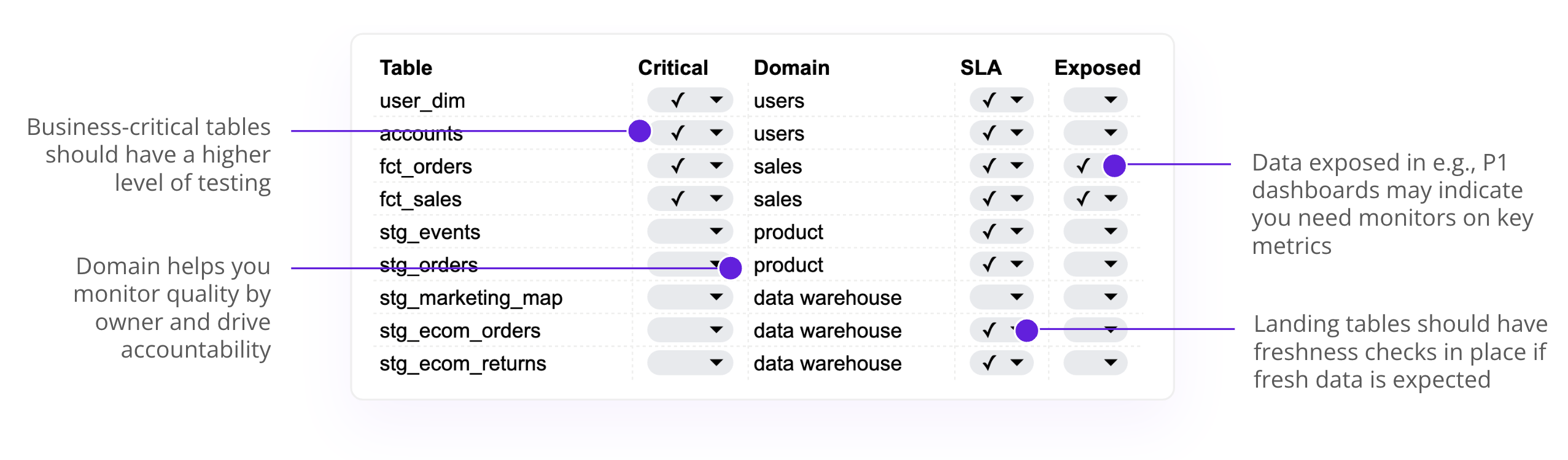
dbt yml files are a great place to define this metadata. This lets you use CI checks, such as check-model tags from the pre-commit dbt package, to ensure that each data model has the necessary metadata, such as a criticality or domain owner tag.
Measuring data quality–the data asset-centric way
Monitoring data quality on an asset level is intuitive: you calculate the uptime and coverage on a table level with the option to segment by metadata dimensions such as owner domain, criticality, and over time.
This gives you a bird’s eye view of your data stack, which areas you’re weak and strong in, and how that relates to your expectations.
We recommend that you consider two metrics to get the most complete picture.
- Uptime – what % of controls in place are passing successfully at each run
- Coverage – what % of data assets have the required controls in place
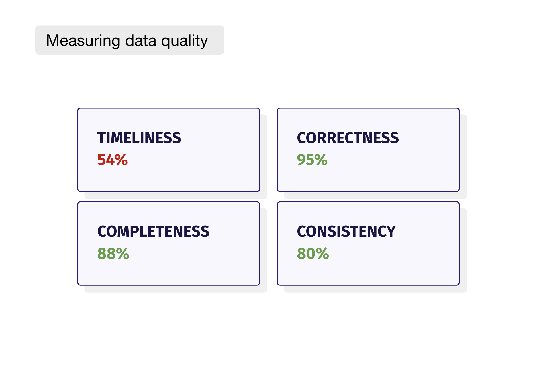
Grouping your quality metrics into semantically similar areas lets you talk about data quality in a way that’s closer aligned to the business use cases. (1) Timeliness–is data fresh and up to date per the SLAs agreed with the business, (2) Correctness–is all data available, (3) Completeness–is data semantically correct and (4) Consistency–is the available data consistent across systems. We also suggest clearly defining when something is “poor”, “ok”, or “good”. In our example, any score below 50% has been marked as “poor, ” meaning an action is required.
Data quality summary table–uptime & coverage across quality dimensions and over time
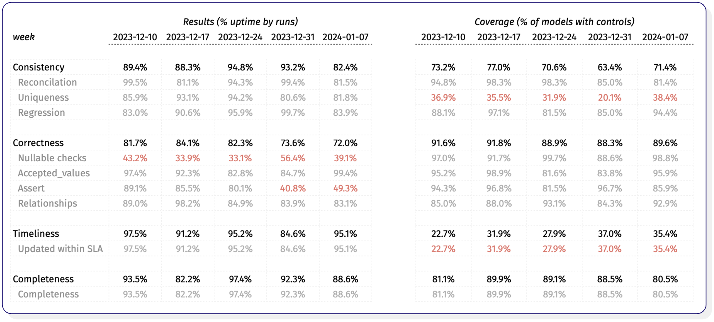
This level of insight lets you start asking questions about your data quality, such as
While we’ve got good coverage of null value checks, we should look into which ones are failing, if they can be fixed, or if we should remove them.
Why has the uptime of our assertion tests significantly declined?
Given the low coverage, does our high uptime on uniqueness tests give us a false sense of security?
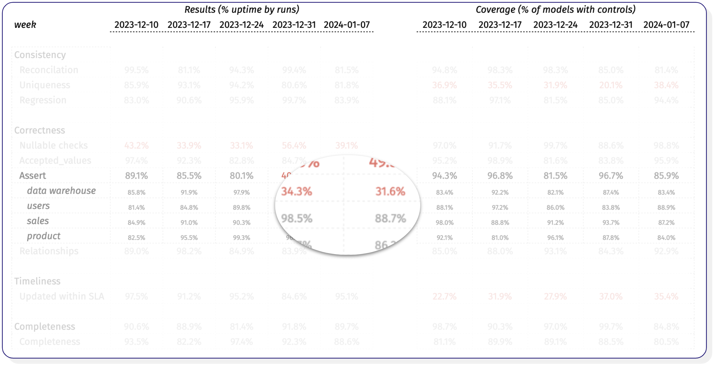
Suppose you’ve specified metadata such as domain owner. In that case, you can segment the data to see that the degrading correctness score is largely driven by assertion tests for tables owned by the data warehouse team–guess you know who to go to now.
The team at Airbnb recently shared their next chapter on measuring data quality, which is also worth a read.
Measuring data quality–the data product-centric way
While the data asset-centric approach above has upsides–it’s easy to understand, implement, and reason about it has one main drawback.
Data asset-centric quality metrics are not intrinsically tied to the use cases of your data.
In other words, your timeliness score can be 95%. But if the data model containing your ML predictions for a critical ad-spend pipeline is failing right before the weekly run, you’re no better off, and your CTO will come to you angrily, asking you to get your data quality under control.
We propose an alternative way to measure your data quality–the data product-centric way.
Data products are a group of related assets, such as dbt models linked by an exposure, tables used by a CLTV model that powers marketing automation, or a selected collection of dashboards in a BI tool. In other words, data products are closely tied to their business use cases.
Data products are akin to the warning lights in a car dashboard. They don’t immediately tell you anything about the underlying metrics (e.g., is the oil level below 10%) but rather that there’s a problem with the product, its importance, and how you should investigate it.
Data products dashboard from Synq–business KPIs are in trouble.
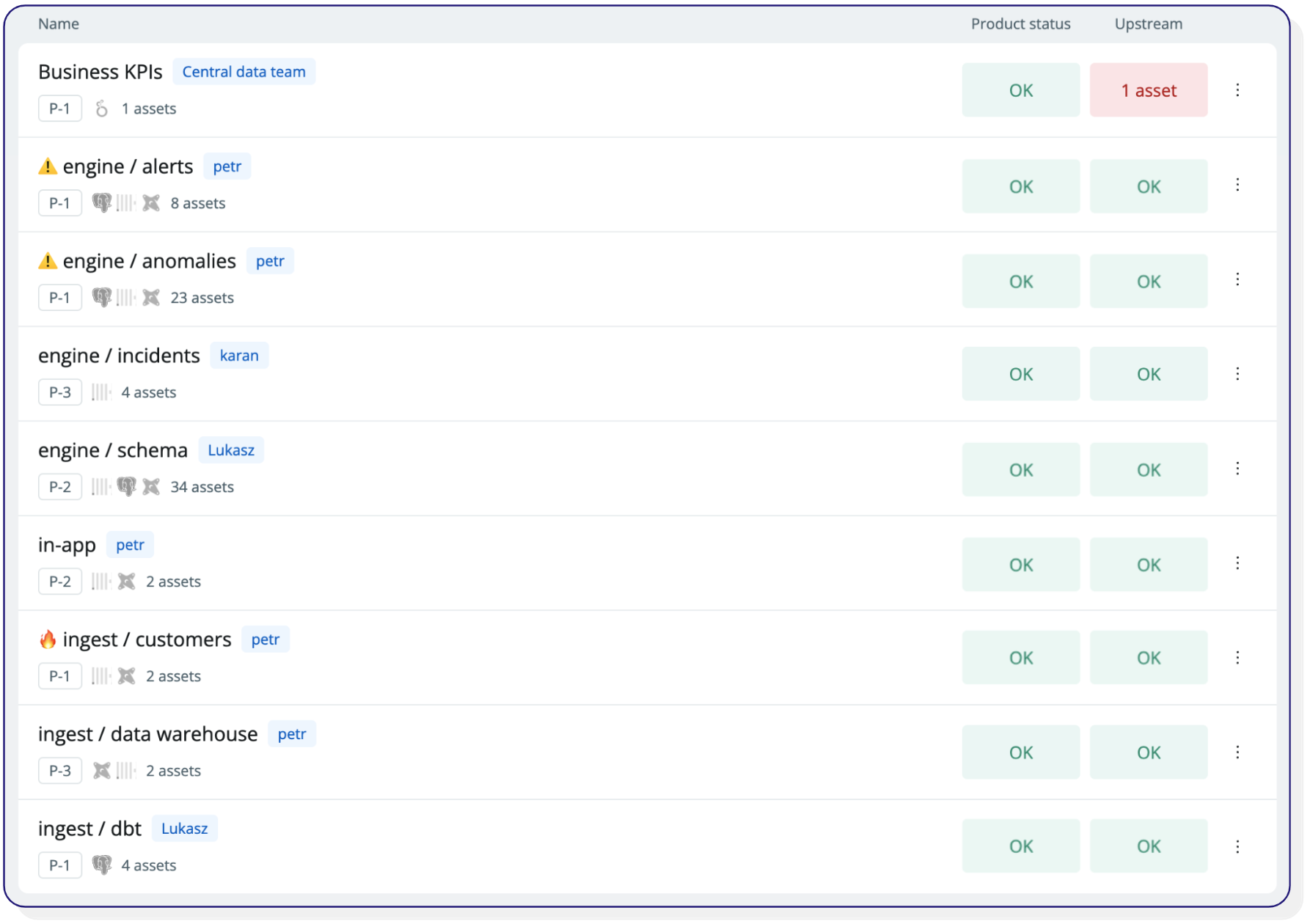
In the example above, you can immediately see an issue with an asset upstream of the Business KPIs data product.
You can track the health of the data product over time, considering issues both on and upstream of the data product. This creates a more intuitive and end-user-centric approach to measuring data health. With this information at hand, you can rightfully tell your CFO that you’ve had reliability issues with your business KPI dashboard with a downtime of 6 days over the past 15 days.
Data product overview
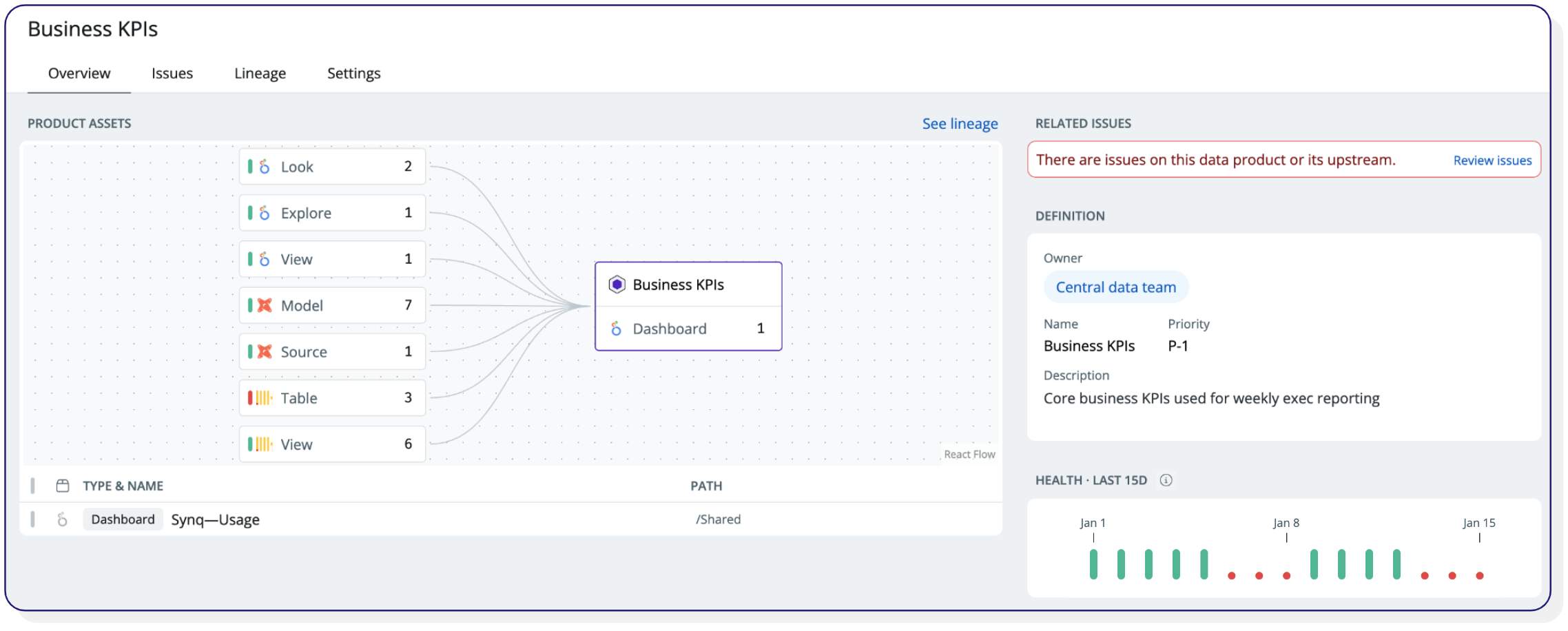
Once you’ve established that the reliability of a data product is problematic, you can go deeper into the different data controls to see the underlying root causes.
Combining quantitative metrics with qualitative insights
Despite having a high coverage of data quality checks and few errors, you may still have blindspots. You can address these by combining quality metrics with qualitative insights and metrics about the data user experience.
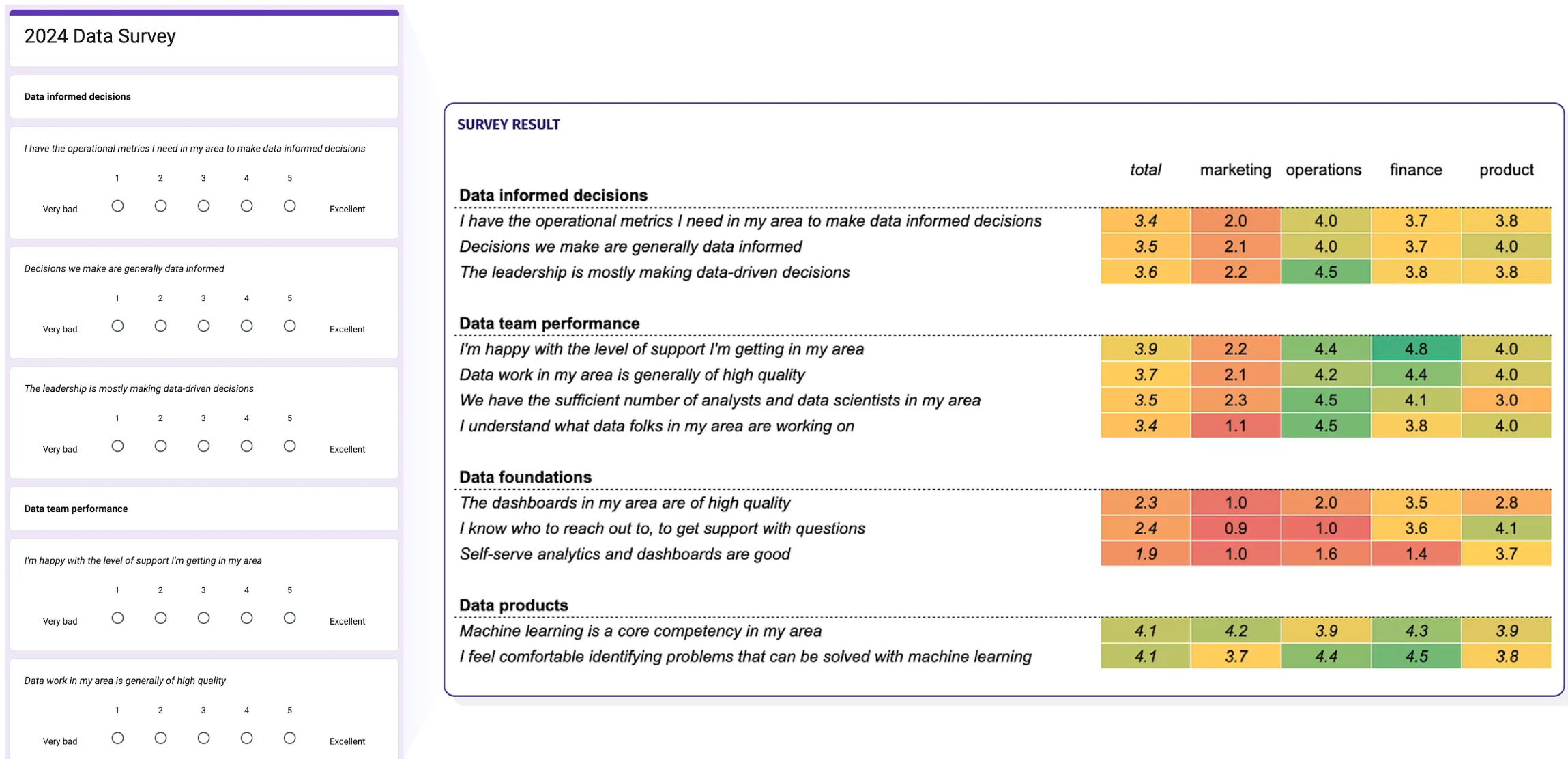
Survey your stakeholders
Combining quantitative metrics with surveying stakeholders can be a good way to uncover areas that need improvement. Ask them to give candid, anonymous feedback on questions such as happiness about self-serve, the quality of their dashboards, and if there are enough data people in their area.
Example data survey to be shared with stakeholders
Declare and monitor data incidents
Data teams are no strangers to incidents. But there’s often no standard way of acting on data issues, and many teams only sporadically declare data incidents.
Unlike automated data quality metrics, incidents are manually declared and categorized (e.g., P1, P2, P3). Keeping a log of historical incidents is a good way to supplement your data quality metrics and be transparent to your stakeholders.
An example of an incident declared in Synq

See our guide to incident management for data teams for steps to implement this.
Monitor data usability
While not strictly a data quality measure, the usability of data assets is often overlooked. This can lead to bad end-user experiences, such as having multiple definitions of the same metric or a bloated stack with hundreds of unused data models and dashboards. To overcome this, we recommend you complement your quality measures with usability metrics such as
- Engagement score – number of users of a dashboard and number of downstream dependencies and queries on a data model
- Usability score – % of columns and tables with a description
These metrics help you with initiatives such as sunsetting unused data models or dashboards, an essential part of maintaining a healthy stack.
Putting insights into action
You’ll often want to put the insights you uncover from monitoring data quality into action. Whether it’s to improve a particular area, share with stakeholders how you’re improving, or something else.
While there’s no one-fit-all solution, we’ve seen these work well.
Automated accountability with a weekly email digest – being the person having to slide into other teams’ Slack channels to tell them that their data quality is not great is not always fun (we’ve been there). Scheduling an automated weekly email with the quality score over time and per owner domain is a great way to bring accountability without one person having to point fingers.
It does wonders when people see their team scoring lower than their peers.
Be religious about including metadata – the most common reason we see for data quality initiatives failing is that everybody owns data quality, and thus, nobody feels responsible. Only by enforcing metadata such as criticality and owner or domain can you hold people accountable for data quality in their area.
Beware of the broken windows theory – the broken windows theory can be traced back to criminology and suggests that if you leave a window broken in a compound, everything else starts to fall apart. If residents start seeing that things are falling apart, they stop caring about other things. We can draw the same analogy to data quality.
If you’ve got many failing tests, it’s often a symptom that the signal-to-noise ratio is too low or that you don’t implement tests in the right places. Don’t let failing data checks sit around. Instead, set aside dedicated time, such as “fix-it Fridays” every other week, to work on these types of issues and remove data checks that are no longer needed.
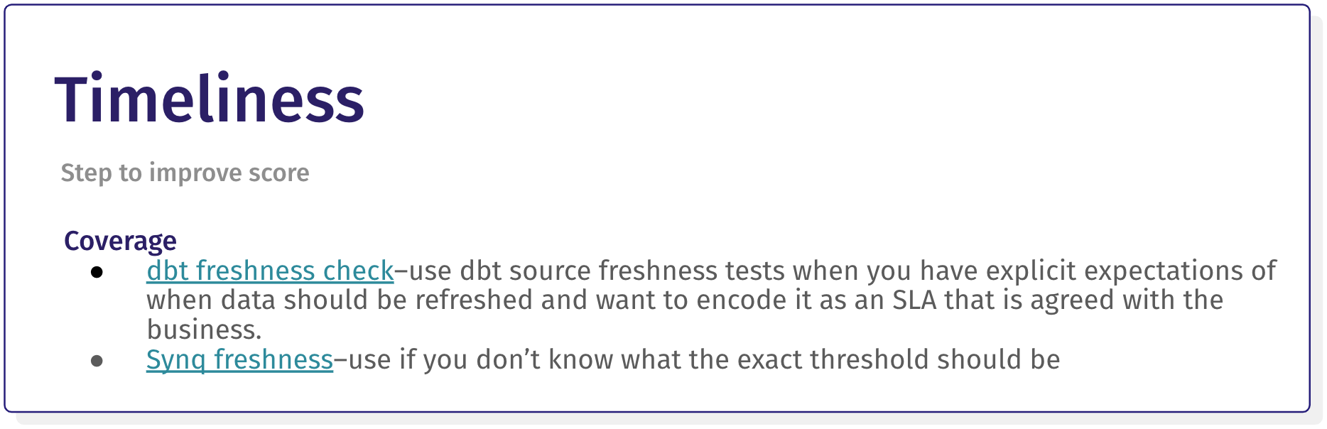
Create run books for data quality – if you’re in a larger team, include clear steps around addressing each data quality dimension so it’s clear for everyone. For example, if the Timeliness score is low, you can recommend steps such as adding a dbt source freshness check or a Synq freshness monitor.
Actioning the data quality score doesn’t have to end here. We already see the best teams taking it further by embedding the quality score on key dashboards to indicate to stakeholders if the data is trustworthy and setting requirements that data assets used in business-critical processes should score “good” before you can expose them.
For a more comprehensive overview of data quality, check out our Complete Guide to Data Quality.
If you’ve any questions or ideas or are curious about monitoring data quality, connect with me on LinkedIn for a chat.

.png)
.png)